dan, Page 2
palette: Orange And Blue -- Weighted
 Orange And Blue -- Weighted
A weighted palette based on Jacob's design at http://colrd.com/palette/22135/
January 4th 2012
color: Tangerine Tango Tangerine Tango
 is the Pantone 2012 color of the year. It's a vibrant color, and I think it's a great choice! I generally love anything orange.
January 4th 2012
Tangerine Tango
Tangerine Tango is the Pantone 2012 color of the year. It's a vibrant color, and I think it's a great choice! I generally love anything orange.
January 4th 2012
color: こきひ こきひ
December 21st 2011
color: おうどいろ おうどいろ August 2nd 2011
color: こけいろ こけいろ August 2nd 2011
palette: Orange & Blue Orange & Blue
Sample 1
November 29th 2011
palette: Winter Of My Discontent Winter Of My Discontent
A cold, earthy feel. Perfect for the dead of winter.
December 30th 2011
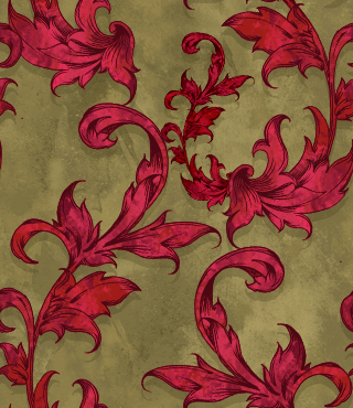
pattern: Vintage Scarlet Vintage Scarlet
August 2nd 2011
gradient: Spectral 11 Spectral 11 August 2nd 2011
palette: Sunrise Sunrise
December 29th 2011
palette: Balsam Flower Balsam Flower
December 29th 2011
color: Sunny Yellow Sunny Yellow
December 29th 2011
palette: Living Room Living Room
December 28th 2011
palette: BrBG 11 BrBG 11 August 2nd 2011
palette: RdYlBu 06 RdYlBu 06 August 2nd 2011
palette: Antique Candy Shoppe Antique Candy Shoppe
My attempt at capturing a nostalgic and sweet feel for use in Advent Conspiracy design gifts.
December 23rd 2011
palette: RdPu 09 RdPu 09 August 2nd 2011
palette: Orange, Blue, Green Orange, Blue, Green
A kind of split complementary palate.
November 29th 2011
color: あか あか
November 29th 2011
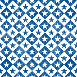
pattern: Horton Horton
August 2nd 2011
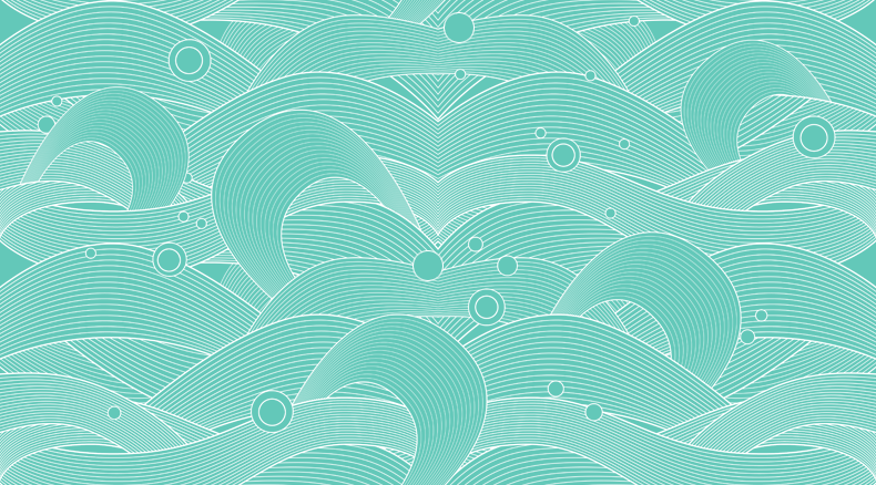
pattern: Waves Waves
August 2nd 2011
palette: PiYG 11 PiYG 11
March 24th 2014
palette: PALETTELP 2 PALETTELP 2
A weighted palette based on PALETTELP
November 28th 2011
color: Tangerine Tangerine
I can literally taste the juiciness of this color.
November 23rd 2011
color: 5RP, 5, 32 5RP, 5, 32
November 28th 2011
gradient: Full spectrum Full spectrum
A simplified full spectrum gradient, inspired by the gradient found at: http://colrd.com/discover/gradient/16991/
November 22nd 2011
color: Friendly Green Friendly Green
Just a nice looking color.
November 18th 2011
gradient: Aquaman Aquaman
Blue, green, with a little yellow. A gradient inspired by the cool end of the spectrum.
November 18th 2011
palette: RYG RYG
A bright palette, not unlike the rasta flag
November 17th 2011
palette: PALETTELP PALETTELP
September 27th 2011
palette: South African Fresh South African Fresh
Green, blue, orange, and gold.
August 10th 2011
color: Dark Purple Dark Purple
Dark and rich, like a purpley chocolate.
August 10th 2011
palette: Pastels Pastels
light green, blue, and pink
August 9th 2011
color: Aqua Berry Aqua Berry
Somewhere between the caribbean ocean and a blueberry.
August 29th 2011
palette: Reds Reds
A collection of reds at the top end of the spectrum. This actually is reminiscent of the palette we used for my wedding.
October 28th 2011
color: Warm Blue Warm Blue
This shade of warm blue is one of my favorite blues at all. At least I think it's warm... or is it cool? I never know which adjective to use when comparing blues.
October 25th 2011
color: Coral Coral
More of this beautiful orange-red
October 25th 2011
palette: Experiments In Choral Experiments In Choral
Loving the unpretentious feel of choral. I'm still experimenting to find great ways to utilize it.
October 25th 2011
gradient: Green & Brown Green & Brown
exactly what it sounds like.
October 21st 2011
palette: Rich Mahogany Rich Mahogany
A I created for use for some client work. The Requested feel was dark woods, leather, etc. Luxury at it's finest. This was inspired by the many leather-bound books in my apartment, which smells of rich mahogany.
August 31st 2011
color: Unripe Blueberry Unripe Blueberry
The color of a blueberry before it's ready to eat.
August 29th 2011
palette: San Diego Chargers San Diego Chargers
In honor of football season kicking off (pardon the pun), I've created a palette in honor of my favorite AFC West team -- the San Diego Chargers. Here's to the playoffs. Go Bolts!
August 29th 2011
palette: CMYK CMYK
A four color palette based on the primary colors in standard printing process. I absolutely love the vibrancy of these colors when they are separated, both on screen and printed out.
August 25th 2011
palette: The Green Album The Green Album
A bright palette inspired by the faux psychodelic cover of Sesame Street's new Green album. Gotta love some kermit!
August 23rd 2011
palette: Huskies Huskies
Here's a palette inspired by the university of Washington. I threw in the watermellon red to provide a counterpoint in accents to the gold.
August 16th 2011
palette: Ocean Sands Ocean Sands
Red, orange, and blue
August 11th 2011
color: 10B, 2, 8 10B, 2, 8
1929
August 9th 2011
color: あらぞめ あらぞめ
August 9th 2011
palette: Down to Earth Too Down to Earth Too
Second attempt at saving earth tone palette
October 26th 2011
palette: coloritos coloritos
September 13th 2011
palette: crayonbow crayonbow
January 5th 2013
color: Spruce Green Spruce Green August 2nd 2011
color: Another blue Another blue
another kind of warmish blue
August 8th 2011
palette: My Place 2 My Place 2
August 24th 2011
My Place 2
My Place 2
August 24th 2011
color: Verdigris Verdigris August 2nd 2011
pattern: Armada Armada
August 2nd 2011
palette: honeycomb 2 honeycomb 2 August 2nd 2011
palette: RdGy 05 RdGy 05 August 2nd 2011
palette: RdGy 11 RdGy 11
November 17th 2013
palette: RdYlGn 07 RdYlGn 07 August 2nd 2011
color: Tangerine Tango
color: こきひ
color: おうどいろ おうどいろ August 2nd 2011
color: こけいろ こけいろ August 2nd 2011
palette: Orange & Blue
palette: Winter Of My Discontent
pattern: Vintage Scarlet
gradient: Spectral 11 Spectral 11 August 2nd 2011
palette: Sunrise
palette: Balsam Flower
color: Sunny Yellow
palette: Living Room
palette: BrBG 11 BrBG 11 August 2nd 2011
palette: RdYlBu 06 RdYlBu 06 August 2nd 2011
palette: Antique Candy Shoppe
palette: RdPu 09 RdPu 09 August 2nd 2011
palette: Orange, Blue, Green
color: あか
pattern: Horton
pattern: Waves
palette: PiYG 11
palette: PALETTELP 2
color: Tangerine
color: 5RP, 5, 32
gradient: Full spectrum
color: Friendly Green
gradient: Aquaman
palette: RYG
palette: PALETTELP
palette: South African Fresh
color: Dark Purple
palette: Pastels
color: Aqua Berry
palette: Reds
color: Warm Blue
color: Coral
palette: Experiments In Choral
gradient: Green & Brown
palette: Rich Mahogany
color: Unripe Blueberry
palette: San Diego Chargers
palette: CMYK
palette: The Green Album
palette: Huskies
palette: Ocean Sands
color: 10B, 2, 8
color: あらぞめ
palette: Down to Earth Too
palette: coloritos
palette: crayonbow
color: Spruce Green Spruce Green August 2nd 2011
color: Another blue
palette: My Place 2
color: Verdigris Verdigris August 2nd 2011
pattern: Armada
palette: honeycomb 2 honeycomb 2 August 2nd 2011
palette: RdGy 05 RdGy 05 August 2nd 2011
palette: RdGy 11
palette: RdYlGn 07 RdYlGn 07 August 2nd 2011


